
How to Choose Silicone Bead Color Palettes
Table of Contents
- What You'll Need Before Choosing Your Palette
- Start With a Focal Color
- Understanding Color Theory for Beading
- Building Bead Color Combinations That Work
- Silicone Bead Color Palette Ideas by Project Type
- Testing Your Palette Before You Commit
- Common Mistakes to Avoid When Selecting Colors
- Frequently Asked Questions
Last Updated: October 12, 2026
What You'll Need Before Choosing Your Palette
Before building a silicone bead color palette, gather actual beads to test combinations in person, screens mislead and lighting shifts how colors read together.
A color wheel helps but isn't mandatory. What matters most is a clear project in mind, keychain, beaded pen, or toddler wristlet, because end use shapes palette selection.
Keep a notebook of combinations that work, and test before committing to a full project.
Start With a Focal Color
Your focal color is the star of the show, the bead that grabs attention first.
Pick something you genuinely love, deep teal, warm terracotta, and don't overthink it.
The focal color usually appears in larger quantities or a prominent position, setting the mood: bold creates drama, soft and muted feels calming.
Understanding Color Theory for Beading
Color theory gives you a framework for choices that work, and you don't need to be an artist to grasp the basics.
On the color wheel, opposite colors are complementary and create visual pop; adjacent colors are analogous and feel harmonious.
For silicone bead color palettes, value is crucial: light blue and dark blue create contrast, while light blue and light pink may blend together and disappear.
Building Bead Color Combinations That Work
Creating bead color combinations is where theory meets practice, moving from thinking about color to arranging beads.
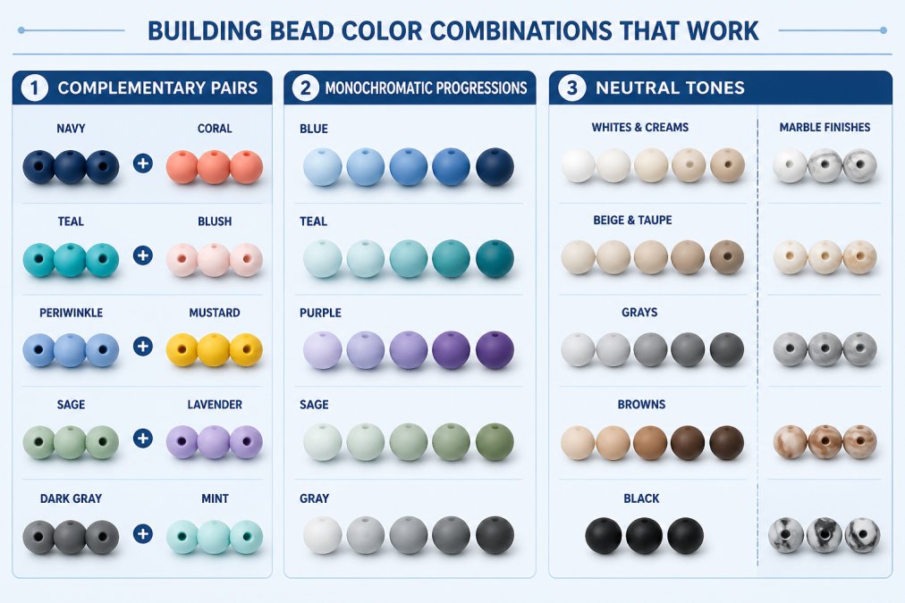
Pairing Complementary Colors
Complementary colors sit opposite each other on the wheel, purple and yellow, blue and orange, red and green, and make each other look more vibrant.
This works beautifully when you want your silicone bead color palette to pop: a yellow focal bead with purple spacers creates instant visual interest.
But complementary palettes demand balance: use one color as dominant and the other as accent.
Creating Monochromatic Palettes
Monochromatic palettes use one color in multiple values, pale pink, medium pink, deep burgundy, or cream, tan, and chocolate brown.
This approach feels sophisticated and cohesive, and is especially popular for minimalist, professional-looking pieces.
Vary values enough that each bead reads as distinct, if light and medium shades are too similar, the design flattens.
Combining Neutral Tones
Neutrals, black, white, gray, beige, tan, brown, are the backbone of most successful silicone bead color palettes.
A neutral palette works for something understated: cream, gray, and black create a timeless look, while tan and white feel warm and natural.
Neutrals also solve clashing: if unsure whether two colors work together, add a neutral between them as a referee.
Silicone Bead Color Palette Ideas by Project Type
A reproducible palette needs a focal color, supporting colors, a neutral, and rough proportions. The recipes below use ratio notation, focal : supporting : neutral. A 3:2:1 recipe means three focal beads for every two supporting and one neutral. Adjust the total count to your project length but keep the ratio intact so the palette reads the same at any size.
Wristlets and Keychains
Seen from a distance and handled constantly, these pieces need contrast and durability more than subtlety.
- Navy and gold, 3:2:1. Three navy 15 mm solid beads, two gold 15 mm solid beads, one cream 15 mm bead. Navy and gold sit near opposite ends of the value scale, so the piece reads clearly across a room. Cream keeps the gold from looking brassy against the navy.
- Teal monochrome, 4:2:1. Four deep teal beads, two medium teal beads, one pale mint bead. This is a value-driven monochromatic recipe: the pale mint acts as the neutral because it is the lightest value in the set.
- Terracotta and sage, 3:2:2. Three terracotta beads, two sage beads, two cream beads. The extra neutral keeps two mid-value colors from fighting each other.
A common pattern: place the focal color at the center and alternate supporting and neutral beads outward, making it the visual anchor even when it isn't the most numerous bead.

Teething Accessories and Pacifier Clips
Baby items get washed, chewed, and inspected, so palette choices here are also material choices. Teething beads are typically food-grade silicone.
- Soft neutral, 3:2:2. Three cream beads, two soft mint beads, two pale gray beads. Low saturation across the board keeps the piece calm and lets it coordinate with most nursery palettes.
- Warm pastel, 3:2:1. Three blush pink beads, two butter yellow beads, one white bead. The white bead is the neutral and the value anchor.
- High-visibility, 3:2:2. Three white beads, two sky blue beads, two charcoal beads. The charcoal gives the piece enough value contrast to be seen against a stroller or car seat, which matters when the item is dropped.
Avoid small decorative beads on anything a child can mouth. Beads that fit entirely in a child's mouth present a choking hazard (Water Beads). When in doubt, size up and skip the tiny spacer.
Beaded Pens and Lanyards
Worn or displayed at close range, often professionally, these should look deliberate rather than playful.
15 mm Solid Silicone Beads 20 pack →
- Black and rose gold, 4:2:1. Four black beads, two rose gold beads, one warm gray bead. The gray neutral softens the contrast between black and metallic without washing it out.
- Navy and silver, 3:3:1. Three navy beads, three silver beads, one white bead. An even split between two colors works here because both are low-saturation and similar in value.
- Forest and brass, 3:2:2. Three forest green beads, two brass beads, two tan beads. The tan neutral keeps the palette from reading as holiday-themed.
For lanyards, weight the recipe toward the neutral, worn against clothing, a neutral-dominant palette is less likely to clash with the wearer's outfit.
Cup Charms
Cup charms are small, personal, and often replaced seasonally, so this is where saturated color and novelty finishes earn their place.
- Rainbow gradient, 1:1:1:1:1:1. One bead each of red, orange, yellow, green, blue, and violet, all the same size. A true rainbow reads best when every bead is the same diameter and finish; mixing sizes breaks the gradient effect.
- Sunset, 3:2:1. Three coral beads, two amber beads, one deep plum bead. The plum is the value anchor and keeps the warm colors from blending together.
- Ocean, 3:2:2. Three turquoise beads, two deep blue beads, two sand-colored beads. The sand neutral is what makes the blues read as ocean rather than as a generic blue palette.
How Finishes Change the Recipe
Finish changes how a color reads. Matte beads scatter light and appear softer and slightly darker than the same color glossy; glossy beads reflect light and appear brighter and more saturated.
Practical rule: swapping a glossy bead for a matte one in the same color is a value change, not a color change, you may need a lighter bead to compensate.
Testing Your Palette Before You Commit
Testing turns a palette from an idea into a buildable plan, catching problems while you can still change one bead instead of restringing the whole piece.
Step 1: Build a Physical Mock-Up
Lay the beads out in the exact order they'll appear, on the exact cord or elastic you plan to use. Cord color changes how beads read: black makes colors deeper and more saturated, white lighter and softer, clear lets bead color show through. With elastic, stretch it slightly as you lay out beads, since tension changes spacing and visual rhythm.
Step 2: Check Value Contrast
The fastest value test is a grayscale photo: convert a picture of your arrangement to black and white and check whether the beads still separate.
A second test is the squint test: step back several feet and squint until details blur. The beads that remain visible are your high-contrast anchors.
Step 3: Check Color-Vision Accessibility
Roughly one in twelve men and one in two hundred women have some form of color vision deficiency, most commonly red-green. A palette relying on red and green beads to carry meaning or create the focal point may look like one muddy color to those viewers.
Two practical checks:
- Value separation. If two beads differ mainly in hue, they may collapse for a color-blind viewer. If they differ in value, they will still separate. Build at least one clear light-dark pair into every palette.
- Pattern separation. Do not rely on color alone to distinguish a focal bead from its neighbors. Use a different size, finish, or shape so the focal point is identifiable without color.
Free color-blindness simulators are available online; run your mock-up photo through one before you commit.
Step 4: Test Under Real Lighting
Natural daylight, warm indoor bulbs, cool white LEDs, and fluorescents all render color differently, a palette balanced in daylight may look yellow-shifted under warm bulbs or green-shifted under fluorescents. Test under the lighting where the piece will be worn or displayed, and under at least two if it moves between environments.
Step 5: Test the Finish Mix
If your recipe mixes matte, glossy, translucent, or speckled beads, test them together. Translucent beads surprise most: they pick up adjacent bead and cord colors, so one that looked neutral alone can take a strong tint. Swap translucent beads to the outside if you want them closest to their original color.
Step 6: Do a Wear or Use Test
String five to ten beads and handle them as the finished piece will be: roll between your fingers, rub against fabric, and wear it for an hour if wearable. This surfaces two problems a flat lay can't, bead edges that catch on clothing, and finishes that show fingerprints or scuffs.
Step 7: Document the Recipe
Write down the final recipe before disassembling the mock-up: bead sizes, colors, finishes, counts, and order. "3 navy 15 mm glossy, 2 gold 15 mm matte, 1 cream 15 mm glossy, repeated twice" can be rebuilt exactly; "navy and gold" cannot. If you sell or gift multiples, the written recipe keeps every piece consistent.

Common Mistakes to Avoid When Selecting Colors
Most color mistakes come from predictable patterns. Knowing these helps you sidestep them.
Using too many colors: More colors don't equal more interesting, six often feels chaotic.
Ignoring value: Many crafters pick colors they like without considering light or dark.
Forgetting about finish: Matte, glossy, glitter, and marble finishes all affect how colors appear, a matte and glossy bead in the same color look different. The 15 mm Opal Glitter Silicone Beads show how finish changes a color's visual impact.
Overthinking it: Sometimes the colors you're drawn to simply work. Trust your instincts.
Choosing the right silicone bead color palette transforms your projects from "nice" to "I want to make that." Start with a focal color you love, understand how colors work together, and always test before committing. At Barkers Creative Designs, we stock solid silicone beads, mixed bags, and specialty finishes for building palettes that work. Start with the 15 mm Solid Silicone Beads in your favorite colors and experiment with combinations that feel right to you.

Frequently Asked Questions
How do I decide on a color palette for silicone beads?
Start by choosing a focal color, the dominant shade that sets the mood for your project. Then use color theory to add supporting colors: pick complementary colors from opposite sides of the color wheel, create monochromatic depth with shades and tints, or build with warm or cool tones. Test your palette by laying beads together in natural light before assembling your project. This simple workflow prevents wasted supplies and ensures colors harmonize.
What are some good color combinations for beading?
Popular bead color combinations include navy blue with white and gold accents for a classic look, blush pink with cream and rose gold for elegance, and black with white and silver for bold contrast. Monochromatic palettes using different shades of one color work well for sophisticated designs. Neutral palettes of tan, beige, and white suit minimalist projects. Try the 15 mm Solid Silicone Beads in black or the 15 mm Silicone Bead Mixed Bags to test multiple combinations before committing to a full project.
How do I use color theory to plan a bead palette?
Color theory for beading relies on the color wheel. Complementary colors (opposite on the wheel) create vibrant contrast, pair blue with orange or red with green. Analogous colors (adjacent on the wheel) feel harmonious, combine blue, blue-green, and green. Monochromatic palettes use one hue in multiple values: light tint, pure hue, and dark shade. Balance warm colors (red, orange, yellow) with cool colors (blue, purple, green) based on the mood you want. Adjust contrast by mixing light and dark values to ensure your design is visually interesting.
How many colors should I use in a silicone bead palette?
Most successful bead projects use 2-4 colors. A two-color palette (focal plus one supporting color) keeps designs clean and bold. Three colors add complexity and visual interest without overwhelming the eye. Four colors work well when one is a neutral base, two are complementary accents, and one is a highlight. Avoid mixing more than four unrelated colors unless you're building a rainbow palette intentionally. Start simple, test your choice, and add colors only if the design needs more depth or personality.